
Dosainfinity brand identity
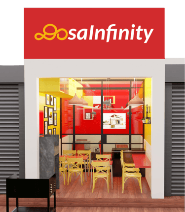
Redesigned the DosaInfinity brand identity, transforming it into a bold, vibrant, and confident fusion dosa café.


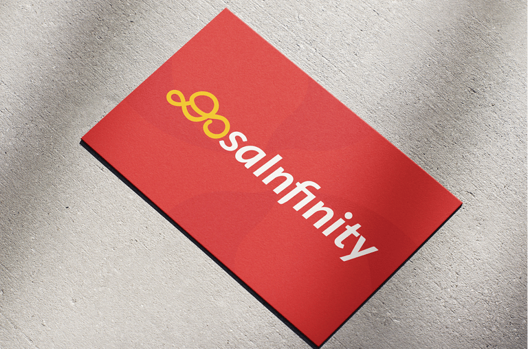
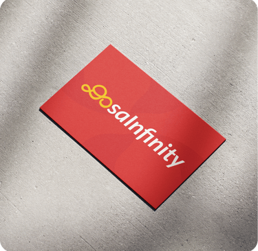
The ‘Do’ is designed abstractly to denote infinity, while the simple wordmark makes it easily memorable for the audience. The ‘Do’ icon can also be used effectively in small spaces.

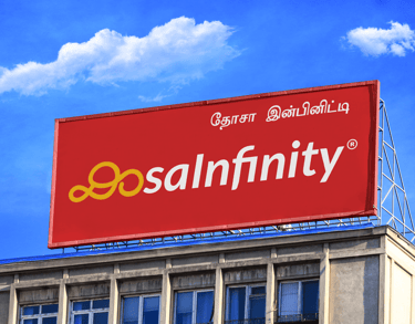
A curated colour palette was created to convey vibrancy and confidence.
The primary red (#D22B2D) reflects energy, passion, and appetite, while the contrasting yellow (#F6B60D) adds warmth, visibility, and appetite appeal.
Supporting tones balance the palette and ensure versatility across applications.