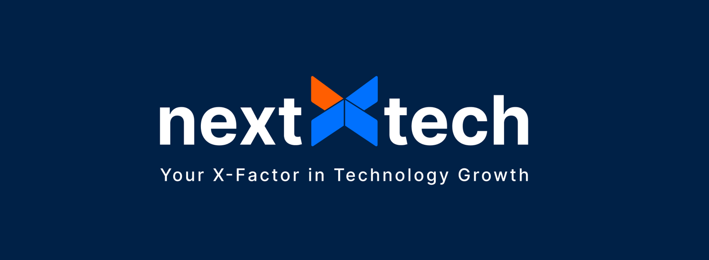
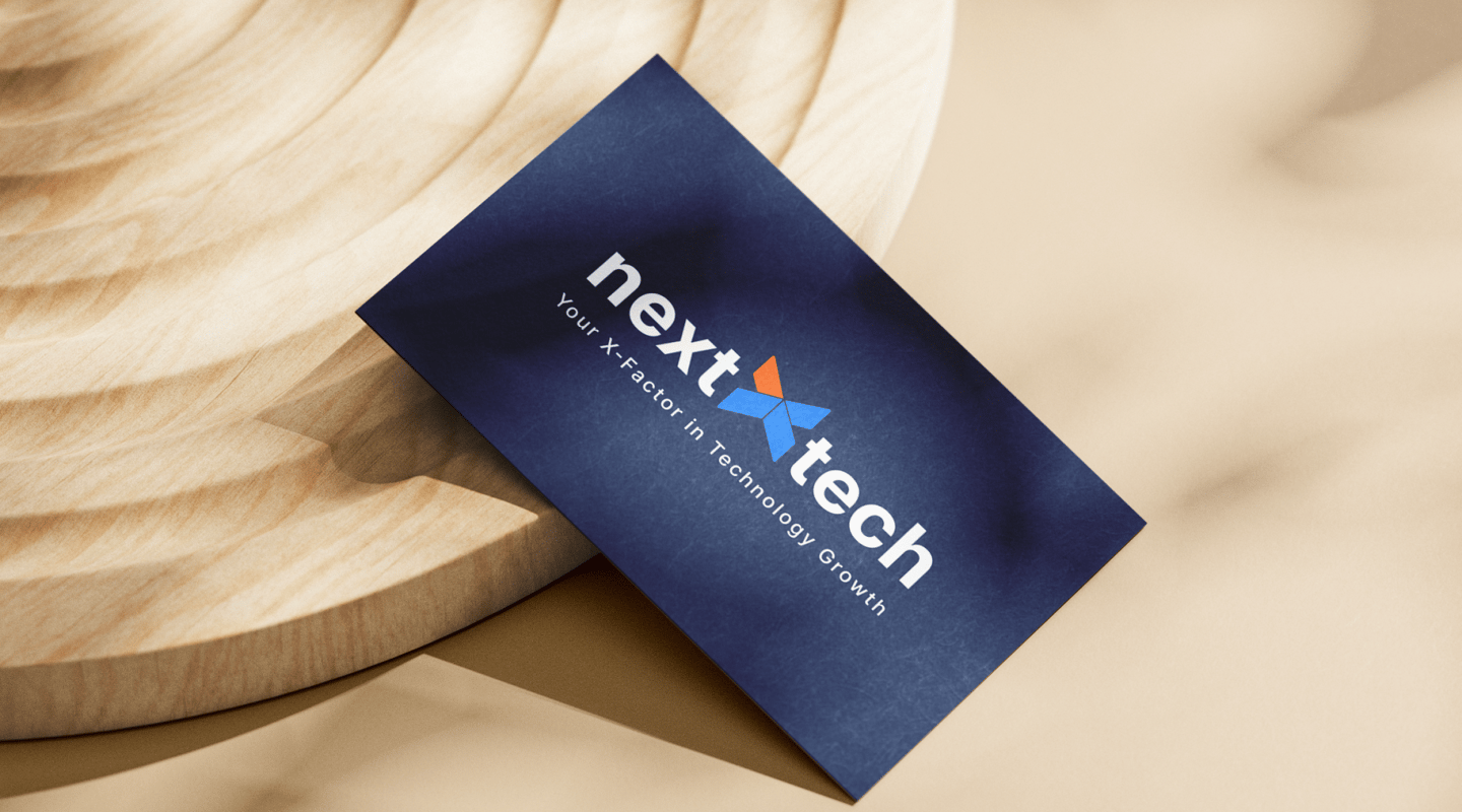
The NextXTech logo is designed as a wordmark, where the “X” is highlighted to symbolize the X-Factor—our unique ability to solve complex challenges and drive growth.
The “X” stands out in blue, representing trust, technology, and innovation.
The orange accent is deliberately placed as a bold, dynamic stroke, symbolizing energy, breakthrough thinking, and problem-solving power.
This design choice reflects our promise: “We are the X-Factor to your problem.”
The bold, non-italic Inter font gives a modern, professional, and confident feel.
The new dimensional ‘X’ adds depth and symbolizes adaptability
The clean, professional typography ensures clarity and trustworthiness, while the contrast of blue and orange communicates balance between reliability and innovation.


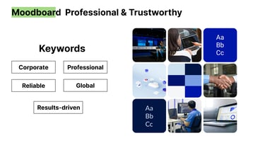
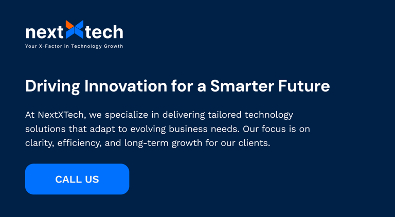
NextXtech is your technology partner, helping businesses scale, innovate, and achieve long-term growth. We bridge the gap between strategy and technology with solutions that empower leaders to future-proof their organizations.
nextXtech
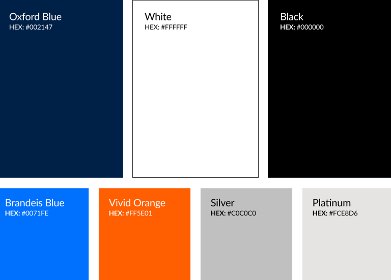
The core colors of Oxford Blue, Brandeis Blue, and Vivid Orange together define the brand’s identity. Oxford Blue establishes trust and professionalism, Brandeis Blue brings a sense of innovation and modern technology, while Vivid Orange adds energy and represents the X-Factor that sets the brand apart.

For titles, we use DM Sans. It’s a clean, modern, and versatile font that highlights the innovative and forward-thinking nature of NextXTech, while ensuring clarity and impact across digital platforms.
For paragraphs we use Work sans. It’s a clean font with high readability.